Understanding Mean, Histogram and Percentiles
This is a short guide to remind you about means, histograms and percentiles in statistics. Then, we will discuss why all these matter and when we can use each of them.
Our Data Set
First, we need a data set so we can calculate these measurements. We will look at a collection of response times collected over a minute from a web app. Here are those values (they are in milliseconds):
255, 168, 125, 11102, 59, 120, 500, 2, 98, 25
By looking at the data set, it's hard to get a clear picture. It would be impossible, if we had a larger data set. (Normally, we'll have larger data sets.)
You can access these values in a Google Sheet, which also has each of the measurements we are looking at in this article.
Analyzing the Data Set
Now we need to analyze this data set and get some information from it. That's why we need to build some measurements.
Mean
Mean is the easiest measurement to generate. Add all the numbers together and divide by the number of items.
For this data set, the mean is 1245.4 milliseconds.
That is, on average it took more than 1245 milliseconds to process a single request.
The mean is a good measurement for representing a whole data set as a single value.
Histograms
Sometimes mean does not represent a data set accurately. For our data set, we got a mean of 1245 milliseconds. But, by looking at the data set, we know a lot of requests took less than 200 milliseconds. So, the mean is not a good representation for our data set.
Mean has a higher value because it's sensitive to outliers like 11,102 milliseconds.
So, a histogram is the answer. It gives us a better view of the data set.
Here's the histogram for our data set:
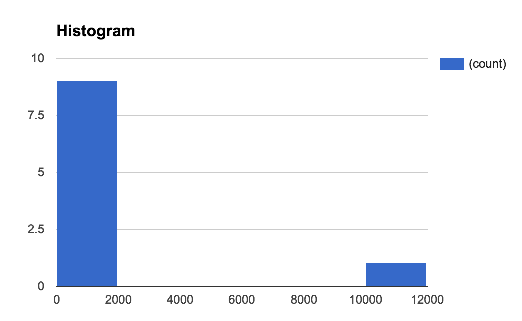
In the histogram, we group data points into equal groups. We call such a group a bin. The size of our bins (binSize) is 1000 milliseconds.
It's clear that we've an outlier. We can get even more information if we make our bin size smaller.
A histogram is a good tool for visualizing a data set. We can see what really happened.
Summarizing
Histograms are always useful for visualizing a data set. But, we can't measure two different histograms and compare them easily. That's why we need to generate summary measurements from a histogram (or from the data set directly).
Let's have a look at a few such measurements.
Median
Median is the value in middle of the data set. We can get it by sorting the data set and picking the value in the middle. In our data set, it's 122.5 milliseconds.
What does the median represent? For 50% of the events, our response time was shorter than 125.5 milliseconds.
So, the median gives us useful information about our data set and it's not sensitive to outliers.
Percentiles
To calculate a percentile, we need to sort our data set and divide it into 100 equal groups. So, the 90th percentile is the value at beginning of the 90th group.
In our case, the 90th percentile is 1560.2 milliseconds.
This means that more than 10% of our user base experienced a response time of 1560 milliseconds or higher. Alternatively, 90% of our users had a response time less than 1560 milliseconds.
Median is equivalent to the 50th percentile. Percentiles are not sensitive to outliers.
Using All These Measurements
We can't say that one measurement is good or bad. Each of them has its own purpose. Let's discuss this.
We will use the response time as an example metric, but our comments hold for any kind of metric.
Mean is a good measurement if we need to compare response times in different periods.
For example, we can plot means for each minute as a graph to see how it behaves. Since it's sensitive to outliers, we can see them as well. Have a look at the following graph:
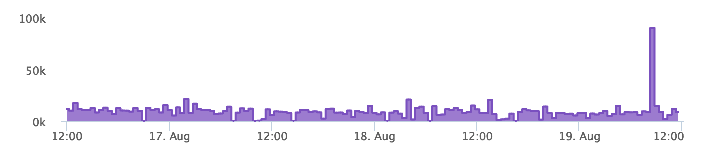
There's a spike at the end of this chart. So, we can tell that there was something wrong then. We can now drill down into the data set at that time and find the problem.
That's when histograms and summary measurements come in handy.
Let's have a look at the histogram of our data set at that time:
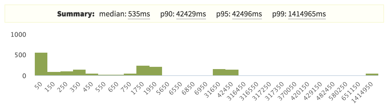
Here, the 99th percentile is very high compared with the other percentiles, which indicates that there is an outlier.
But interestingly, our 90th and 95th percentiles are also quite high. So, that seems like a problem.
Normally, we try to reduce response times. That's why we never look at lower percentile values like the 5th percentile. But, depending on your data set, you can pick any percentile you want.
For the response time, we usually look at the median, the 90th, 95th and 99th percentiles. It's up to you to decide which percentile you are going to look at.
If the response time is very critical to your app, you can try to reduce the 99th percentile. Otherwise, you could try to optimize the response time for the 90th or 95th percentile.
If you are really not worried about the response time, you could try to optimize the median.