Analyze CPU Profile
Once you have recorded a profile, you can analyze it to understand what was running in the app. Monti APM provides all of the common tools for analyzing a CPU Profile.
Overview
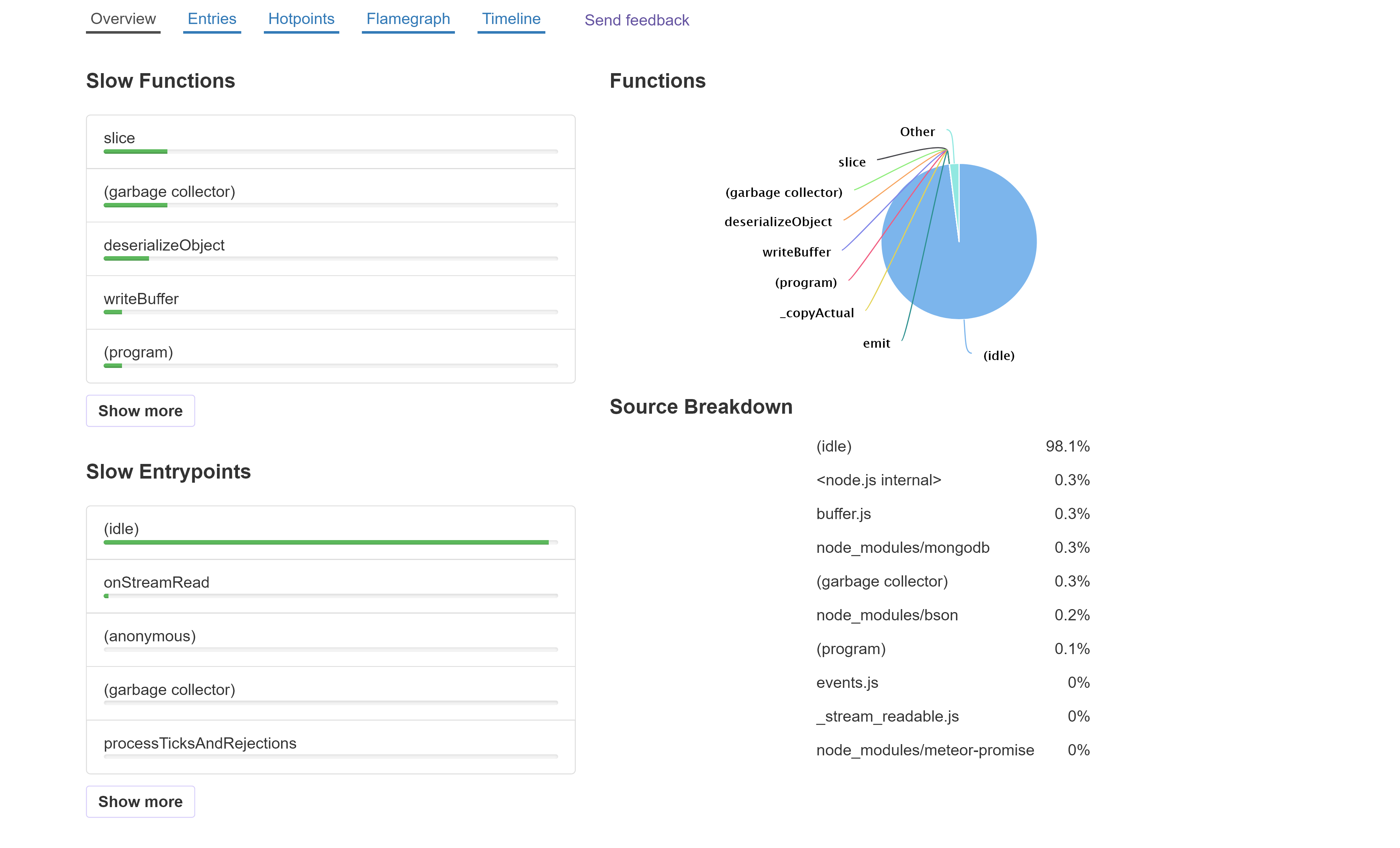
The default view is the Overview. This provides a simplified look at the same data as the other views.
On the left, we have a list of functions in the app, sorted from slowest to fastest. Beneath that is a list of entry points - the initial functions that are called by v8 when code is run from starting the app or from the event loop.
On the right is a pie chart showing the list of functions, along with how much time was idle.
The Source Breakdown groups the functions by where they are from (app, a package, Node.js, etc.).
You can select an entrypoint or function to view a Flamegraph with. The selected function will be highlighted in the flamegraph.
Entries
The entry points are where code starts to run; the bottom function in stack traces. This could be from an event, such as the server receiving a DDP message, a timer firing, or it could be a function run from the event loop.
The Entries view shows a list of all entry points. You can expand any row in table to see the functions it called.
The Total time is how much time was spent in a function, including the time in functions it called.
The Self time is how much time was spent in a function, excluding the time in functions it called.
You can click Total and Self to change the sort.
Hotpoints
The Hotpoints view is similar to Entries, but it instead shows a list of all functions that time was spent inside of. You can expand any row to see the functions that called it.
Another common name for this type of view is the bottom-up view.
When you expand a hotpoint, the children's total and self times are calculated differently than in other views. The times are not the amount of time they ran, but instead the amount of time the top-level function ran when called by it. Let's look at an example:
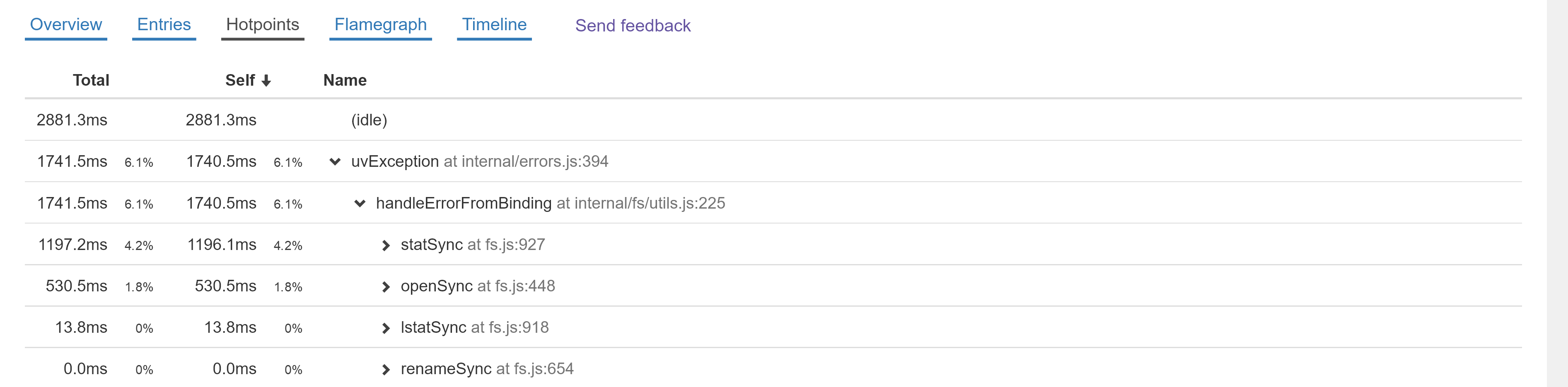
We see that the uvException's self time was 1740.5ms. Since it is expanded, we can see it was called by handleErrorFromBinding. handleErrorFromBinding didn't necessarily spend 1740.5ms within itself; instead, that number shows the amount of time uvException spent when called by handleErrorFromBinding.
The next 4 rows show the functions that called handleErrorFromBinding. They show that uvException spent 1196.1ms when statSync called handleErrorFromBinding and 530.5ms when openSync called handleErrorFromBinding.
This is useful to find the specific paths within your app that are slow and are worth optimizing.
Flame Graph
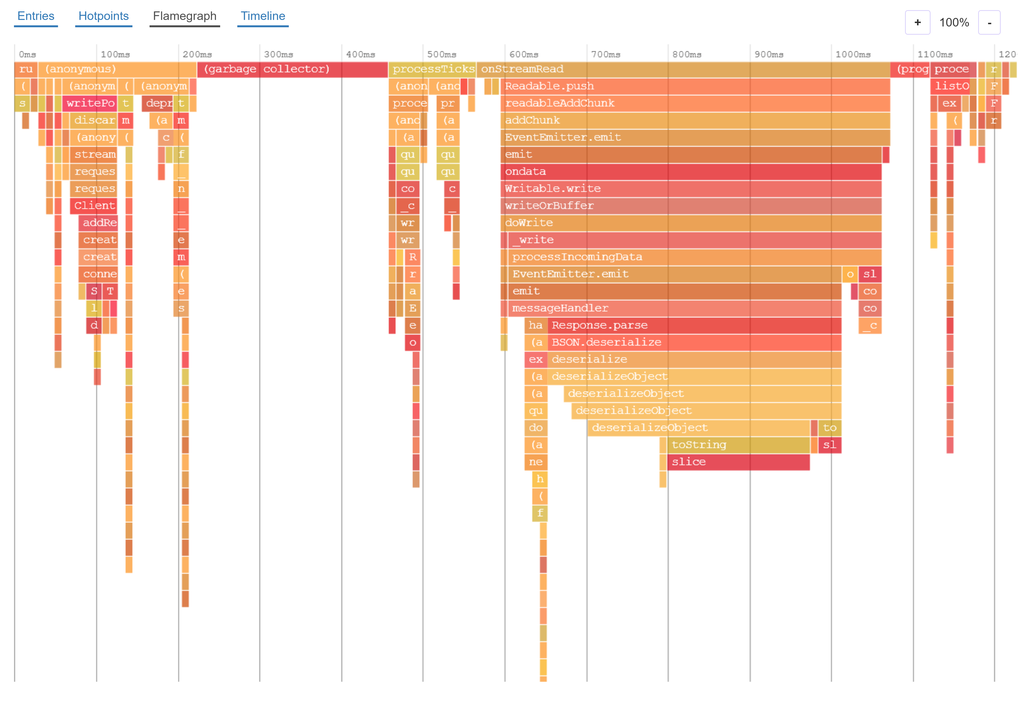
Flame graphs are a different way to visualize the information in Entries, and make it easy to see which call paths take a lot of time.
Here is a flame graph:
- Each rectangle represents a function
- The color and order of the rectangles has no significance
- The functions on the top row are the entry points
- The width of the rectangle represents the total amount of time the function was running (the total time in Entries and Hotpoint views)
- Each function can have multiple rectangles beneath it. These are the functions it called
- The space beneath a function where there are no children rectangles represents the self time, the amount of time spent within the function itself instead of within functions it called
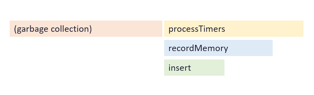
In this example flame graph, there are two entry points: garbage collection which spent a little over half the time, and processTimers which rest of the time was spent in.
processTimes called the function recordMemory, and recordMemory called insert. There is some empty space beneath recordMemory, and this represents the amount of time spent within recordMemory.
Interacting with Flame Graph
You can zoom in to the flame graph by scrolling with your mouse wheel or track pad, or using the zoom buttons above the flame graph. To get more details about a function, you can hover your mouse over it.
Timeline
The timeline is similar to the Flame Graph, but instead of showing duration on the x axis, it shows time. You can see what was running at specific points in time.
When viewing a profile from continuous profiling, please note that it only checks what is running once every 9 - 10ms, and there could be many other functions that run in-between.
How to analyze
There is no one way to analyze a profile. It usually depends on how the software being profiled works, and what the cpu issue is.
If you want help, it is possible to share a link to the cpu profile with other people.